Introduction
Best Fonts for Your Blog are more than just letters on a screen; they can shape how readers perceive your blog and how they interact with your content. The right font makes your text easy to read,
Reflects your blog’s personality, and can even influence your blog’s SEO performance. With so many options, picking the best font for your blog can be overwhelming.
This guide will help you understand the importance of fonts, how to choose the right ones for your blog, and which fonts work best for readability, style, and performance.
Why Fonts Matter in Blogging
The font choice plays a major role in a reader’s experience on your blog. Imagine reading a beautifully written post in a hard-to-read or cluttered font it would ruin the experience, no matter how great the content. A good font must be clear and easy to read.
Think about the length of your posts and whether your audience is skimming through your blog or reading it thoroughly. The easier the font is to read, the more likely they will stay longer on your blog.
Beyond readability, fonts should reflect your blog’s style and tone. A playful, creative blog about DIY crafts might benefit from more whimsical fonts, while a tech blog would likely use something sleek and modern. In addition to appearance, consider how the font impacts your blog’s loading time.
Fonts that take too long to load can slow down your page, which could lead to a higher bounce rate and a drop in SEO rankings. Faster, web-optimized fonts are always the better choice for improving user experience and performance. Lastly, consider accessibility.
A good font is one that everyone can read, including people with visual impairments or reading difficulties. This ensures that all users can comfortably navigate your content.
Serif vs. Sans Serif Fonts: Which to Choose?
When you start exploring fonts, you’ll notice two main types: serif and sans-serif fonts. Serif fonts have small decorative lines, called serifs, at the ends of each letter. These fonts create a formal and traditional appearance, commonly seen in books, newspapers, and lengthy content.

They work particularly well when you want to convey a sense of authority or trustworthiness in your writing. In contrast, sans serif fonts have a sleek, modern style, lacking the decorative lines at the ends of letters.
This makes them appear more straightforward and minimalistic, which is why they’re commonly used for websites and mobile devices.
For most blogs, sans serif fonts are an excellent choice for body text due to their simplicity and ease of reading on screens. However, serif fonts can still be effective when used in headings or titles to add a touch of elegance or a traditional feel.
For instance, a lifestyle blog might use a combination of both, with serif fonts for its headlines and sans serif for the main text, creating a balance between professionalism and readability.
Best Serif Fonts for Blog
If you’re leaning toward using serif fonts, there are a few tried-and-true options that work exceptionally well in a digital format.
Georgia is one of the most popular serif fonts for blogs. It’s a classic font that is highly readable, even on smaller screens, making it a great choice for long articles or text-heavy posts.
Times New Roman, another traditional serif font, may seem outdated for some, but it still holds its ground as a reliable, professional font. If you want something with more style, Playfair Display is a beautiful serif font that blends tradition with modernity.
It’s perfect for headings and makes a strong visual impact while maintaining a clean, polished look.
Every serif font has its own distinct role. Georgia works best for readers who expect clarity and comfort over long periods, whereas Playfair Display adds a bit of flair to your headlines.
The key is experimenting with different styles and seeing which best aligns with your content’s tone and audience’s preferences.
Why Sans Serif Fonts Are a Favorite
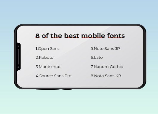
Thanks to their minimalism and clarity, sans-serif fonts are perhaps the most popular choice for blogging. Open Sans, for instance, is widely used by bloggers because it’s versatile and easy to read on all types of devices, including mobile.
This font gives your blog a clean, modern feel, making it perfect for both body text and headings. Roboto, another favorite in the digital world, is especially popular in tech blogs due to its geometric design and professional look.
It’s a no-nonsense font that works well for readers who want to consume content quickly and efficiently.
Another excellent sans serif font is Lato. Lato offers a slightly friendlier and more approachable vibe, making it ideal for personal or lifestyle blogs where the tone is more relaxed and conversational.
If your blog covers a wide variety of topics, from serious content to light-hearted pieces, a font like Lato can help bridge the gap by staying professional yet welcoming. Overall, sans serif fonts are a safe bet for any blog, given their simplicity and ease of use across different devices.
The Use of Display and Script Fonts in Blogging
If you want to inject creativity into your blog’s design, use display or script fonts for specific areas. Display fonts are more decorative and are generally reserved for headings, logos, or special banners.

Their bold, striking designs make them ideal for grabbing attention, but they should be used carefully, as they can overwhelm your content if overused.
Popular options like Oswald and Bebas Neue are perfect for impactful titles or featured sections where you want to make a strong visual statement.
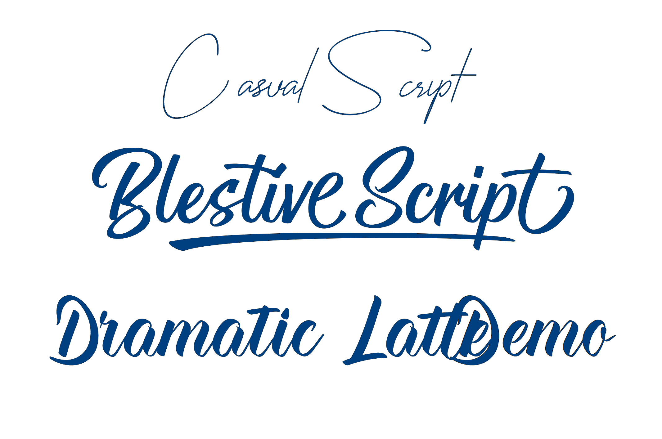
On the other hand, script fonts mimic the handwriting style and can add a personal, creative touch to your blog. These fonts are perfect for blogs focusing on DIY projects, lifestyle, or personal journaling.
Script fonts like Pacifico or Great Vibes can make your blog feel more intimate and connected to your readers. However, they can be difficult to read in long paragraphs, so it’s best to reserve them for short phrases, such as quotes, headings, or signatures.
Custom Fonts vs. Web-Safe Fonts
Choosing between custom and web-safe fonts is another decision that can affect your blog’s appearance and performance. Custom fonts allow you to create a unique, distinctive look that sets your blog apart from others. However, these fonts come with a downside.
They often require additional load time, slowing down your blog’s performance. Site speed is crucial for user experience and SEO, so relying too much on custom fonts could backfire by slowing your blog.
On the other hand, web-safe fonts, such as those available through Google Fonts, are designed to load quickly and display correctly on all devices. These fonts are reliable, widely available, and won’t negatively impact your blog’s speed.
For instance, Open Sans, Roboto, and Lato are all web-safe fonts that perform well across various platforms. For most bloggers, it’s wise to stick with web-safe fonts as they offer a good balance between aesthetics and performance, keeping your blog running smoothly without compromising on style.
Pairing Fonts for a Professional Look
A well-paired combination of fonts can transform the look of your blog from basic to professional. The most common approach is to pair a serif font for headings with a sans serif font for the body text.
This pairing creates contrast, helping your headings stand out while ensuring your main content remains easily read. For example, pairing Playfair Display for your headlines with Open Sans for your body text gives your blog a modern yet elegant look.
Font pairing doesn’t have to be complicated. There are several online tools, like Fontjoy or Typ.io, that help you experiment with different font combinations until you find the perfect match for your blog. Just remember not to overdo it.
Two or three fonts are more than enough to create a visually appealing and cohesive design. Too many fonts can make your blog look cluttered and disorganized.
Mobile-Friendliness and Font Choice
In today’s world, a significant portion of your readers will be visiting your blog on their mobile devices, so it’s crucial that your fonts look good on small screens as well. Fonts that work perfectly on a desktop may become too small or difficult to read on a phone or tablet.

This is where sans serif fonts like Roboto and Open Sans shine. They maintain their clarity and legibility even when scaled down for mobile viewing, making them a top choice for blogs with a large mobile audience.
Always test how your chosen fonts look on mobile devices. Google’s Mobile-Friendly Test is a great tool to ensure that your blog’s fonts are responsive and easy to read on all devices.
A mobile-friendly font improves not only the user experience but also your blog’s SEO, as search engines favor websites that provide a better experience for mobile users.
Implementing Fonts for Maximum Impact
Once you’ve selected your fonts, it’s important to implement them correctly to ensure maximum impact. Font size, line height, and letter spacing all contribute to how easily your content can be read.
For body text, a font size of 16px to 18px is usually ideal, with headings being larger to create a clear hierarchy.
Adjusting the line height to about 1.5 times the font size helps create enough space between lines, making your content easier to read without overwhelming the reader.
Proper spacing between letters, especially in larger headings, is also essential for readability. If the letters are too close together, your text can feel cramped and difficult to read. Make sure also to optimize your fonts for speed.
This means only loading the fonts you need and using CSS to manage font loading, ensuring that your blog remains fast without sacrificing design.
Conclusion
Choosing the best font for your blog is about more than just aesthetics; it’s about creating an enjoyable reading experience for your audience. The right font enhances readability, aligns with your blog’s design, and works seamlessly across devices.
Whether you opt for the elegance of serif fonts, the modern simplicity of sans serif fonts, or a creative touch with display and script fonts, the key is to balance readability with style. By following these guidelines,
You’ll not only improve your blog’s visual appeal but also create a welcoming, user-friendly environment that keeps readers coming back.
Some Common Questions
1. Best font for blog in Word
When creating a blog post in Microsoft Word, you should choose a font that translates well to the web. Some of the best options include Calibri, Arial, and Times New Roman. These fonts are widely recognized, easy to read, and commonly used for web content, ensuring that your blog will look professional when transferred from Word to your website.
2. Best font for blogging free
If you’re looking for free fonts for blogging, Google Fonts is an excellent resource. Some of the best free fonts for blogs are Open Sans, Lato, Roboto, and Montserrat. These fonts are easy to read, load quickly, and work well across all devices, ensuring an optimal reading experience for your audience.
3. Best font for article writing
The best fonts for writing articles focus on readability and clarity. Georgia and Times New Roman are excellent choices for long-form content because they are designed to be easy on the eyes during extended reading sessions.
If you’re working in a digital format, Open Sans or Roboto are also great options for ensuring that your articles are clear and professional.
4. Google Fonts
Google Fonts is a free collection of fonts optimized for the web, making it a go-to resource for bloggers and web designers. It offers various fonts, including serif, sans serif, display, and handwritten fonts.
Popular choices for blogs include Lato, Merriweather, Roboto, and Montserrat. Google Fonts are known for their quick load times and compatibility across different platforms, which improves user experience and SEO.
5. Best font size for blog posts
The ideal font size for blog posts depends on the font you choose, but generally, a body text size of 16px to 18px is recommended for readability. For headings, you can go larger, typically 24px and above, depending on the importance of the heading.
A well-balanced font size ensures that your readers can comfortably read your content on both desktop and mobile devices.
6. Charter font
Charter is a classic serif font that’s often used for long-form content, like articles or academic papers. Its clear, balanced design offers excellent readability, making it a good choice for blogs focused on education, news, or research. Its elegant, traditional style also adds a professional touch to your content.
7. Best font for testimonials
When choosing a font for testimonials, you want something that is both professional and approachable.
Fonts like Georgia, Open Sans, or Lora are excellent choices. These fonts are clear and legible, helping to highlight the authenticity and sincerity of the testimonial. It’s important to select a font that matches your blog’s overall style while ensuring the text stands out and is easy to read.


